Restaurant Marketing Case Study: How to Design a Menu Page

Here’s a great example of how to develop a menu page on your restaurant or catering business website.
We work with a lot of restaurant and catering businesses at Marketing 360®. Many who come to us initially have debilitatingly poor websites that do nothing to win over new diners.
Beyond outdated, cluttered design overall, the biggest problem we see is poor menu pages. A restaurant website needs to do two things well. The first is make sure diners can find the restaurant by highlighting location information. The second is to excite diners with attractive images of the cuisine.
When a potential diner is checking out a restaurant or catering website, the first thing they want to do is get an idea of what food is offered and how much it will cost.
And – important to note – they’re probably on their phone.
A PDF of the print menu (we see this a lot) just doesn’t work here. You need a better design.
Here’s a great example from Good Thyme Eatery in Provo, Utah (click through to see menu page). Let’s highlight what we did on their UXI® design.

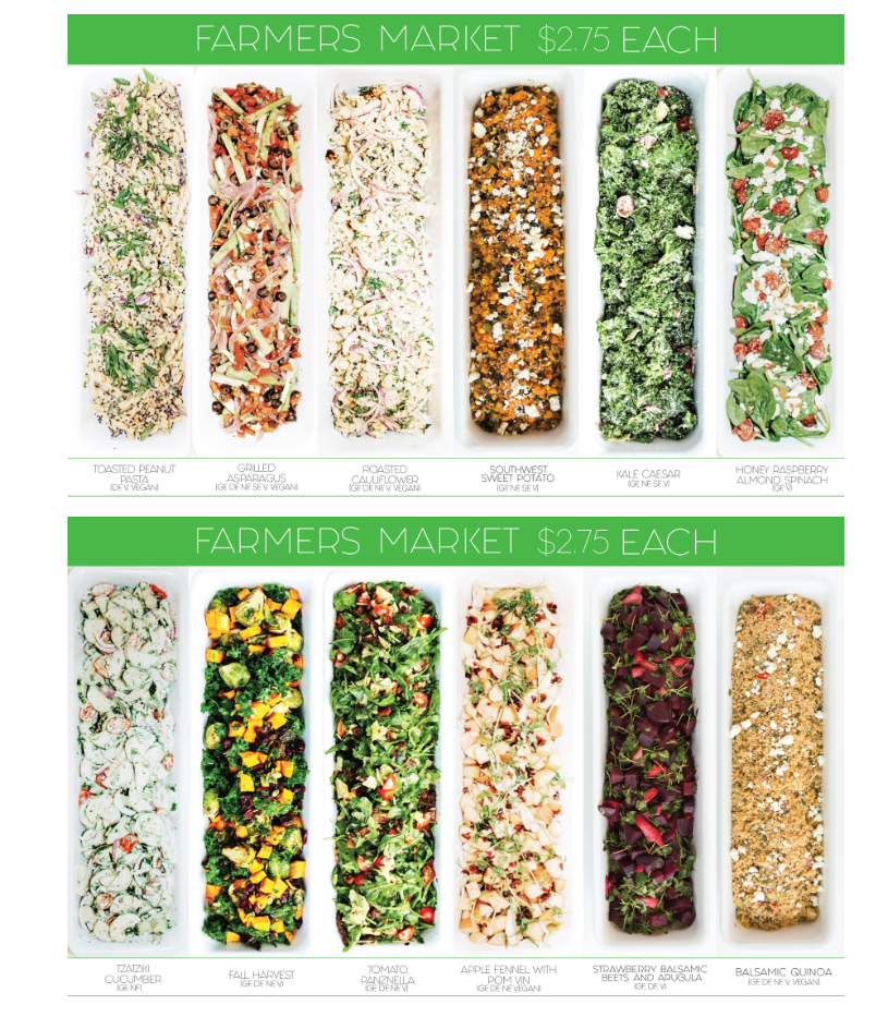
- The menu is broken up in the categories that allow for simple pricing.
- Professional images are authentic and appetizing (not stock photos).
- The menu displays the same on desktop and mobile screens.
The menu on this website is a great example of elegant design. It’s beautiful and – more importantly – functional. Aside from the homepage, it’s the second most visited page on the site.
Does it work? You can see the increase in their conversions in the last 6 months:
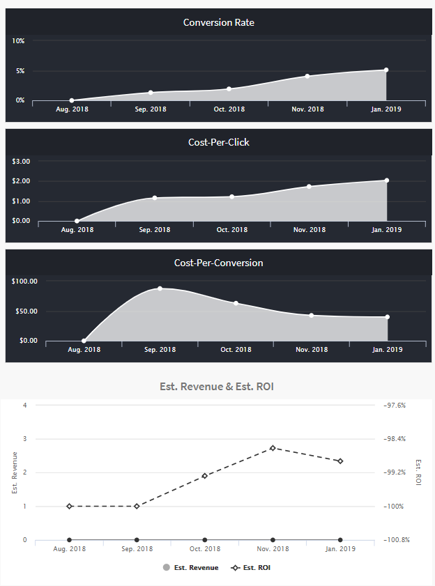
The lower cost per conversion and increased revenue are always a sign of things going in the right direction.
Design – like plate presentation matters. For a restaurant or catering website, plate presentation starts on the website menu page. Get cooking.
*Results are based on past client performance. Individual account performance may vary. Results are not guaranteed.