Case Study: How to Design a Restaurant Website
Restaurant websites must have a few fundamental elements in place to be effective for marketing. Here are some tips on what to do, and what to avoid.
If there’s any industry that seems to struggle with the fundamentals of website design and user experience, it’s restaurants. In fact, many websites are uncannily bad.
From celebrity chefs that think their picture and history should dominate the content to local joints with no menu, phone number, or location, these websites are the culinary equal of Dog Chow.
This is odd because what users want from a restaurant website couldn’t be more straightforward. A restaurant website should consist of the following content:
- Identification of the type of food served with a quick link to menus.
- Fast-loading menu page with full item names, descriptions, and pricing.
- Click to call phone number in the header, sidebar, and footer (best if the phone number is always visible).
- Hours of operation and address in the header, footer, and contact page with link to Google Map listing on both homepage and contact page.
- Contact form or link for making an online reservation.
- Contact form or link for online ordering/delivery (if applicable).
- Images of the actual restaurant and dishes (not stock photos).
- Banner and/or page with happy hour, discounts, and menu specials.
- Page that lists entertainment and events (if applicable).
Perhaps the single biggest thing is to have the location, phone number, and hours of operation immediately visible without any scrolling (remarkably few restaurant websites get this right).
A restaurant website is useless unless it gets diners through the door or generates delivery orders. The web content itself is a means to an end, which is why it’s so problematic when the content is actually making it difficult for diners to find what they want.
Slate did an article on bad restaurant websites a few years ago, and the author came up with an interesting conclusion as to why design is so bad in this industry:
Restaurant sites are the product of restaurant culture. These nightmarish websites were spawned by restaurateurs who mistakenly believe they can control the online world the same way they lord over a restaurant. In restaurants, the expertise is in the kitchen and in hospitality in general. People in restaurants have a sense that they want to create an entertainment experience online—that’s why disco music starts, that’s why Flash slideshows open. They think they can still play the host even here online.
Considering how off-track many restaurant websites are, this is a plausible explanation. The article also notes that budget is often a problem – but not a lack of it.
Instead, it’s often the case that a restaurant will invest thousands on a website design, causing the project to veer from the utilitarian, user-friendly design that works best, towards vanity projects that take on a life of their own.
Many of these problems double-down on mobile, which is inexcusable for restaurants. The user experience on mobile, where potential diners are actively looking for a place to eat, is critical.
Below are some case study examples of restaurant websites designed on the UXI® platform with many strong elements. Use the best of these sites as a guide to designing a website for your restaurant that converts visitors into diners.
Nikko Japanese Restaurant
https://www.nikkosushibar.net/
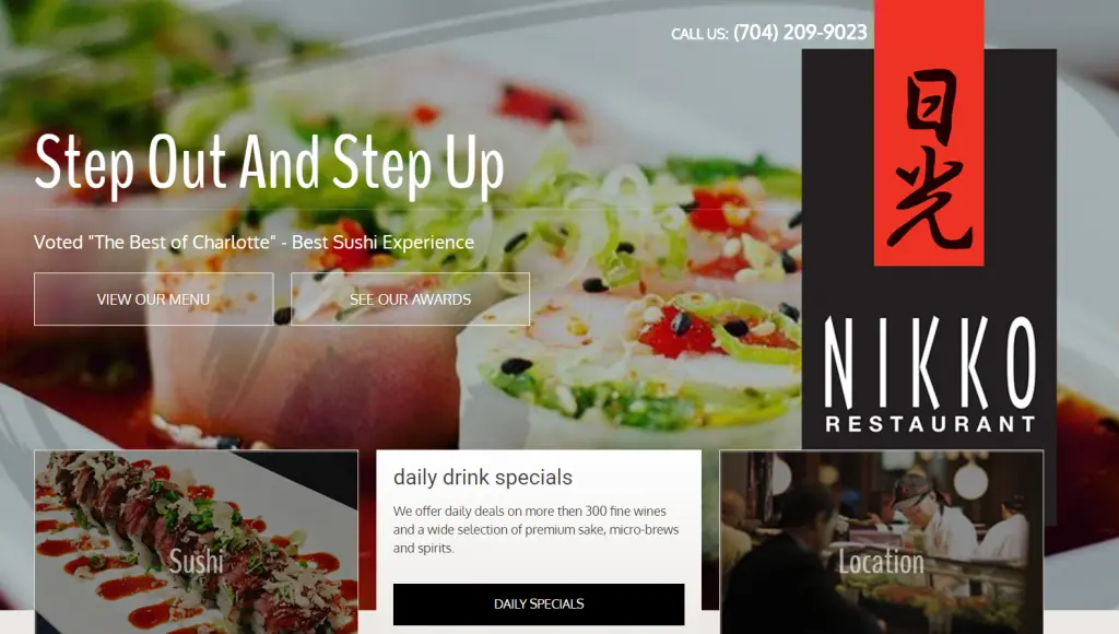
Notes:
- Phone number well placed
- Easy links to menu
- Easy link to location
- Daily specials link
- Authentic images from restaurant
- Menu is a clear copy of print menu embedded into the webpage; prices included
Al Vento
http://www.alventorestaurant.com/

Notes:
- Easy, intuitive navigation boxes
- Address prominent on homepage (but they need to add their phone number)
- Hours of operation, specials, and menus easy to access
- Menu is clean and clear with prices
Dakota Farms
http://www.dakotafarmsrestaurant.com/
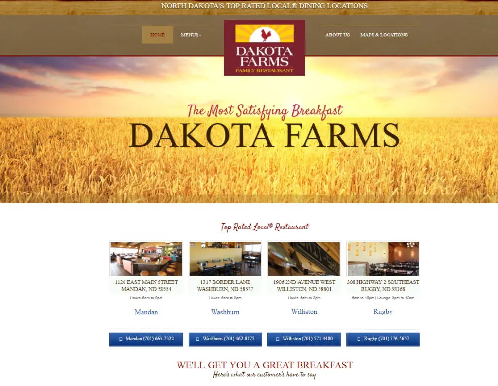
Notes:
- Excellent display of contact info for restaurant with multiple locations
- Customer reviews on homepage
- Menu has excellent descriptions but lacks prices
- Good use of images except large stock photo of wheat field on homepage – an image of food or dining area would be more useful
Here are more examples of restaurant website designs.
When you design a website for your restaurant, remember that it’s essentially a portal. Most people don’t want to spend more than 5 to 10 seconds on it, maybe 30 if they’re checking the menu.
People are hungry and ready to eat. Use your website to get them to your restaurant as fast as possible. Once they’re seated, that’s when you start working to impress them.
Find top rated restaurants near me.
*Results are based on past client performance. Individual account performance may vary. Results are not guaranteed.