A Heuristic for Website Conversions
Is your small business website failing to convert? Here is a straightforward heuristic that will get you back on track.
Business Website Conversion Heuristic:
When your goal is conversions, clarity trumps cleverness.
This is a simple statement, but its value as a heuristic is expansive. When you apply it, it will change your entire approach to design and – in particular – copywriting. Your focus will move from your personal tastes, back to what informs and persuades your audience.
You’ll move from complexity to simplicity. From heavy content that slows your load times to lean, clean design refined to what’s necessary.
In the world of small business websites, cleverness tends to become clunky and unclear. Clarity becomes elegant and straightforward.
Let’s clear things up.
What do you do and why should I care?
When we talk about clarity, just what do we mean?
First, it means you’re clear about what you do. There are still too many websites that fail to communicate what they do, where they do it, and how they can be contacted.
Lack of clarity with these basics is inexcusable. If visitors are unsure they’re in the right place, they won’t take the time to work it out. They’ll just bounce and search elsewhere.
Here is a pool service that is really clear about what they do and where they are:
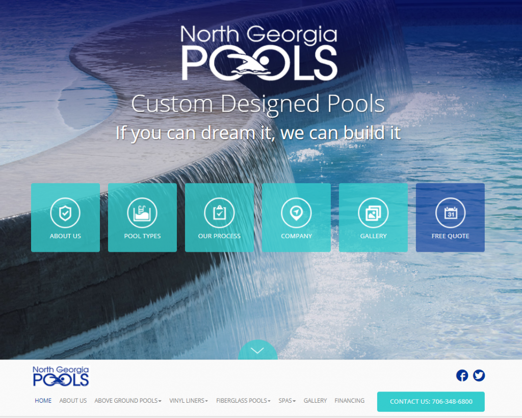
The name of their company also states where their service area is. The simple, intuitive navigation makes it easy get more information. They offer custom designed pools of all types, so I know what they can do for me.
The elegant waterfall image looks great, but to double-down on their message they should consider a hero shot, perhaps with a family enjoying one of their pool designs.
Why a visitor should care relates to how you develop your value proposition. Key to this is making it clear why someone should choose you over the competition.
A huge key here is specificity. For example, it’s common to see statements like this:
Chiropractic Care
And People You Can Count On
Proudly offering the best chiropractic care in
Springfield for over 30 years.
We’re here to help.
This value statement is saddled with vague, obvious generalities. They say they are the best but offer no proof. I can “count on” them because they are “here to help.”
A visitor will assume all this. People will be unmoved by phrases such as:
- Customer service is our priority
- We are committed to working with our customers
- Your success is our success.
You’re a business. I assume you’re committed to working with customers.
Be specific about a particular value you deliver on. For example:
 The simple statement of “same day treatment available” is specific and has the real potential to solve my problem, especially considering my back is probably in pain at this moment.
If I have chronic pain, trying a “non-surgical” solution is an option I seriously want to consider.
In contrast, consider this website, which has a clever headline:

This is an example of where the desire to be clever is compromising clarity. In fact, except for the small sub-heading under the business name, you wouldn’t even know this is a dental office. Letting your smile “soar” is clever alliteration, and that idea ties into the hawk. But what that has to do with dental care is a mystery.
Clever, but ineffective.
Clarity is Deceptively Difficult
When you look at the pool and chiropractic website examples here, you may think what they’re doing doesn’t look that hard.
It doesn’t look hard. Because clarity is based on simplicity, the end results look simple.
But achieving this result is anything but easy. If it were easy, then there wouldn’t still be a plague of business websites out there telling us how important customer service is to them.
There are several challenges you need to overcome to achieve clarity with your website content.
Get Over Yourself
The first challenge is to get over yourself. You are not your website visitor or prospective customer. In fact, you are the opposite. You know too much about your business; you’ve been inside too long.
It turns out the dentist is actually the guy pictured with the hawk. If you take the time to read his bio, you discover that working with birds is a hobby of his.
Apparently, he’s so convinced this is interesting that he thought it would make great website content. And no doubt when he looked at the end result, he loved it.
But for a person looking for a new dentist, this is just confusing.
A Fresh Set of Eyes
A key step that most SMB design projects miss is getting a fresh set of eyes on design and content.
You can test the clarity of work by getting people to look at your site for the first time, with no other context than being a potential client for your services.
Let them look at your website for 10 seconds then ask:
- Do you know what we do?
- Do you know where we are and how to contact us?
- Do you know what our main service is and what its benefits are?
- Do you know how we can solve your problem?
A website with clear messaging conveys this information so visitors can answer these questions in moments. If your testers can’t answer these questions, you’re not communicating your message clearly.
Walking in your customer’s shoes and viewing your content with “fresh eyes” is difficult. It requires empathy and humility.
But when you do, you’ll realize that your attempts at being clever or unique aren’t having their intended effect on your audience.
Remember that today’s digital consumers are impatient, skeptical and jaded. They are on your website because they are looking for a solution to a specific problem, not to be wowed by creative marketing.
They demand clarity. Either you let them know you have what they need, or they’ll vanish, with no memory of the clever, creative ideas you thought were so powerful.
Follow the heuristic.